Design Portfoilo.
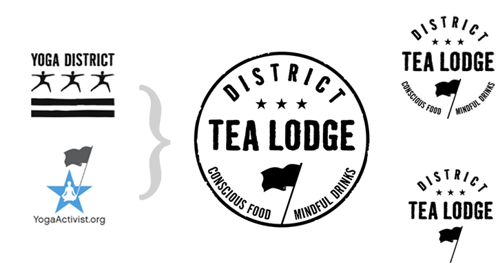
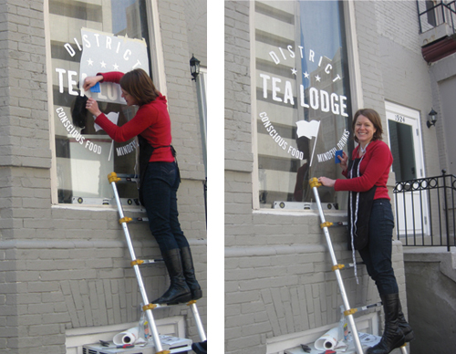
CLIENT: District Tea Lodge
PROJECT: (Work in progress) designed a versatile logo and food & tea menus for new tea cafe/restaurant in Washington, DC. Incorporated previously chosen design elements to reference connections to the sister business and nonprofit org by the same owner.
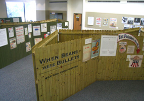
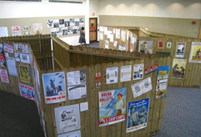
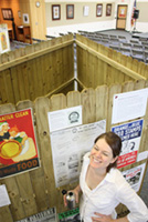
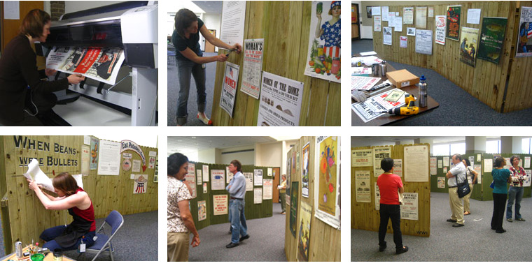
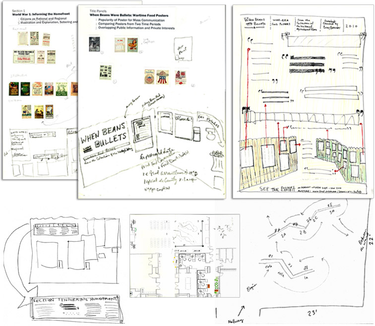
CLIENT: National Agricultural Library (NAL) / When Beans Were Bullets food poster exhibit
PROJECT: Planned, researched, designed and produced a physical exhibition of war-era food posters from the collection of the National Agricultural Library (NAL), for visitors to the public library of the USDA and its large exhibit area. Challenged to let the posters, many of which were heavy with text, "speak for themselves." Kept captions and exhibit script minimal in length, and visually minimal to keep these elements distinct from the archival material.
Developed mobile, self supporting structures made from prefabricated fence panels. Although the fences served as "instant walls" they also created an appropriate and attractive backdrop for the content. The fences helped show how the posters would have been displayed historically, as mass-produced materials (not as framed artworks). Created all coordinating signage, text panels, and handouts.
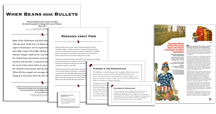
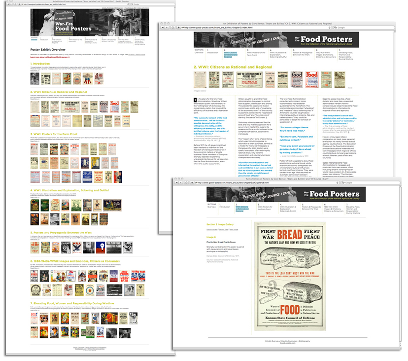
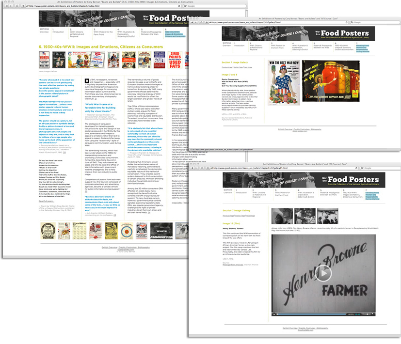
CLIENT: Self / National Agricultural Library (NAL)/ Beans Are Bullets and Of Course I Can! online food poster exhibit
PROJECT: An easy to navigate, quick to load, legible, online poster exhibit created with HTML and CSS to compliment physical exhibit and extensive historical research. Clean design provides flexible space for contextual writing and captions of varying lengths, detail images and embedded video clips, but allows the posters to serve as the primary focus of project. Well-organized, professional display worthy of NAL affiliation. Large images needed to be big enough for researchers and educators to read, examine and show in classroom settings, but not big enough to print (files belong to the NAL; reprints are available from them).
Muted colors chosen to prevent the design of the site from competing visually with the patriotic posters that already use the color red to grab attention; desirable to maintain and reserve the power of this color in the posters.
Visit live site in new window.
Visit live site in new window.
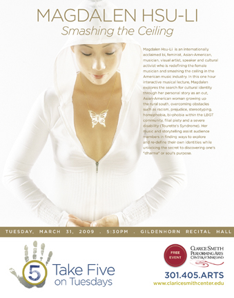
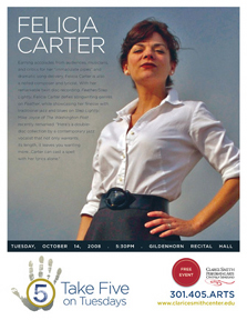
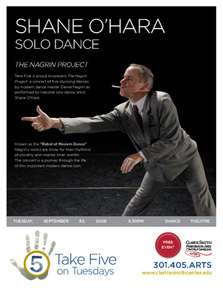
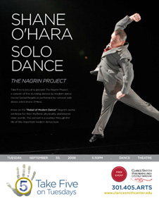
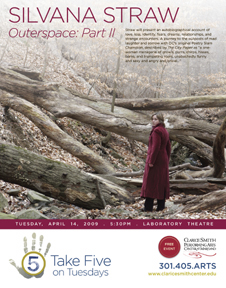
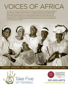
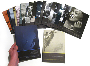
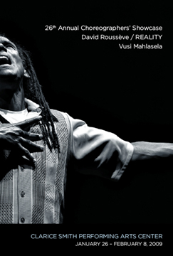
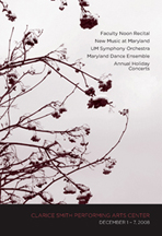
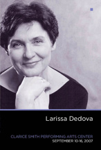
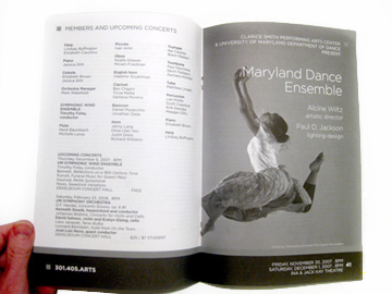
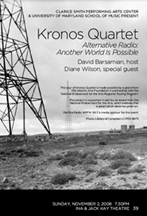
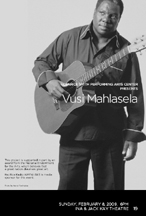
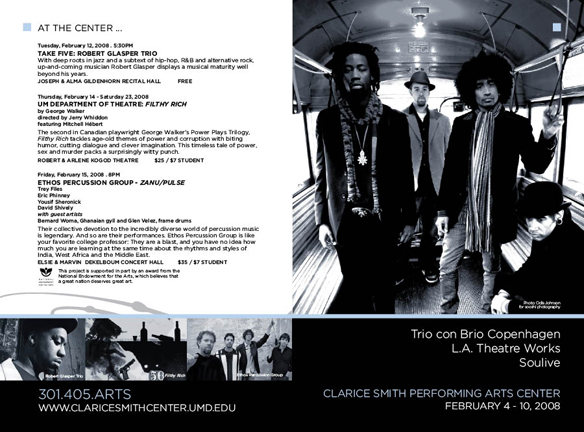
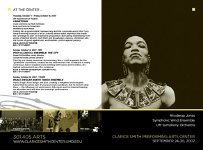
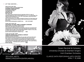
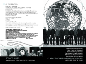
CLIENT: Clarice Smith Performing Arts Center
PROJECT: Posters and fliers advertising upcoming performances at arts center. Posters: 20" x 28". Fliers: 8.5" x 11".
Weekly program books produced for audiences of performing arts center. Professionally printed. Finished books: 9.25" x 6.25", varying page lengths, 20-70pps.


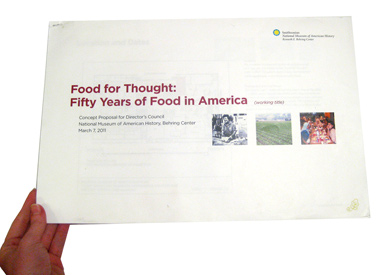
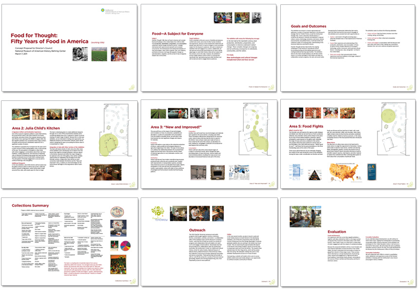
CLIENT: Exhibition team at the National Museum of American History, Smithsonian Institution
PROJECT: 30-page project proposal document measuring 11" x 17". Used by an exhibition team to present ideas to museum directors, fellow curators and prospective donors. Challenged to create a flexible layout that could accommodate pages with varying lengths of texts, gallery floor plans, detailed object lists and numerous images on a page or pages with no images at all.
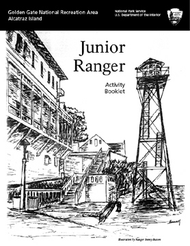
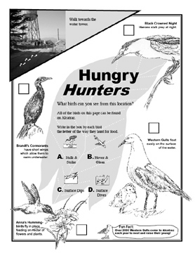
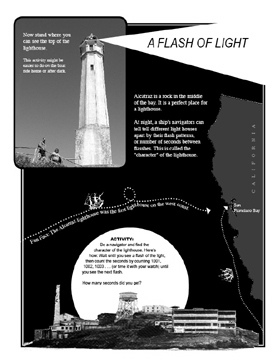
CLIENT: National Park Service, Alcatraz Island
PROJECT: Jr. Ranger Booklet (sample pages) for young visitors to Alcatraz Island. Worked with park rangers/park staff to develop content ideas, drawings, games. Included original photography to help with wayfinding. Challenged to keep content interesting while limited to one-color printing.
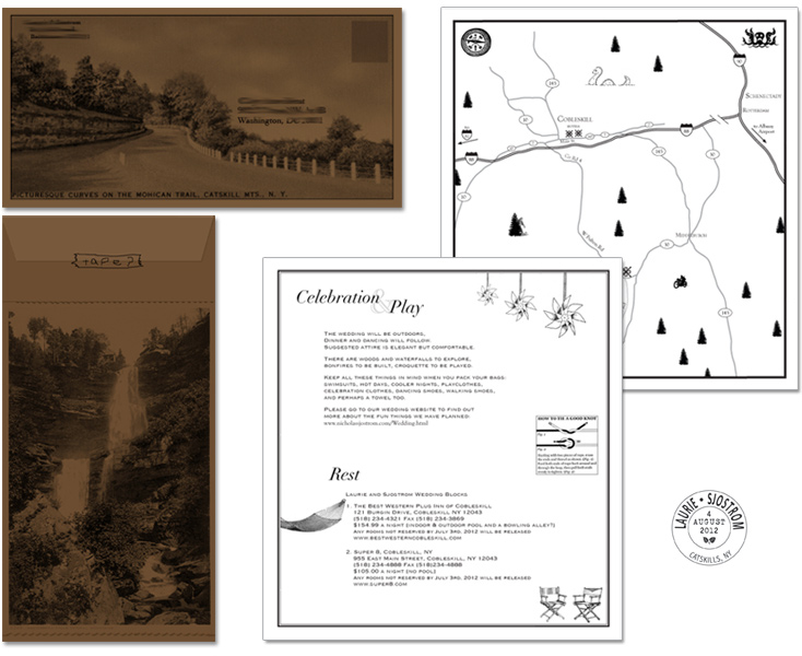
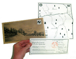
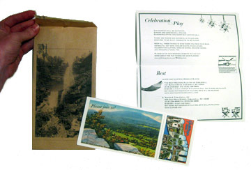
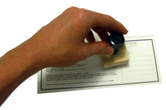
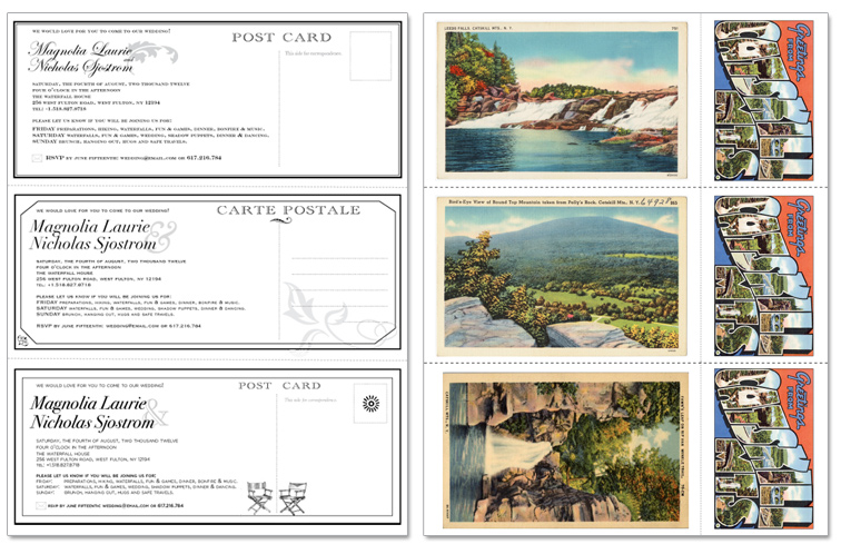
CLIENT: Laurie & Sjostrom Wedding
PROJECT: Invitation package (mock-ups, the mailed invite and additional mock-ups below)
Clients requested a vintage postcard look and feel printed on cream paper. I suggested a brown envelope to add contrast to creme papers and provide eye-catching surfaces to print additional postcard imagery. Due to travel required for the wedding, I suggested a theme of travel and road trips. Recreated map of area useful to guests whether flying or driving to wedding location, carefully noting airports, major and key roads, hotels, event venue and state parks. Added playful features and references to the couple. Researched historical postcards of Catskill Mts, textured brown kraft envelope and designed an original rubber stamp to add color and texture. I suggested leaving right side of invitation for a personal note from the couple to create a more intimate invitation to match the intimate size of the wedding.
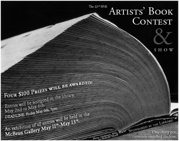
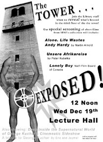
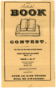
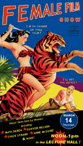
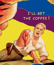
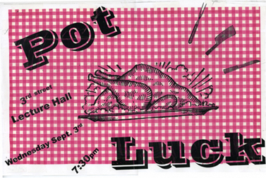
CLIENT: San Francisco Art Institute Library
PROJECT: Intentionally humorous, quick & dirty posters announcing film & video shows, artists' book contests and other events.
Mixed media, collage, tissue paper and copier machine.
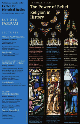
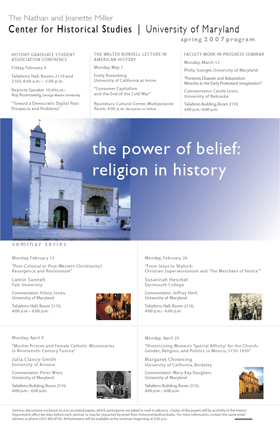
CLIENT: Center for Historical Studies, University of Maryland
PROJECT: Text-heavy posters announcing lecture series.
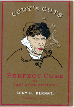
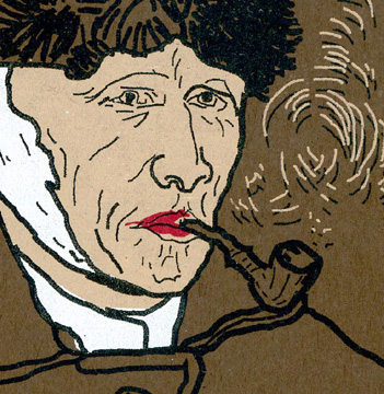
CLIENT: Cory’s Cuts
PROJECT: Postcard exhibit announcement, 6" x 9". Silkscreen, 4 inks on heavy brown stock.
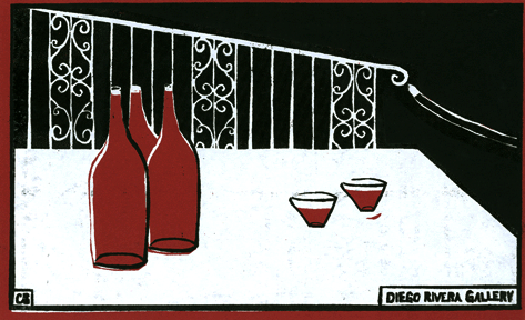
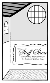
CLIENT: Staff Show, San Francisco Art Institute
PROJECT: Postcard exhibit announcement, 6" x 9". Front: Silkscreen, black and white inks on heavy wine-colored stock.
Back: Illustrator drawing of the Diego Rivera Gallery.
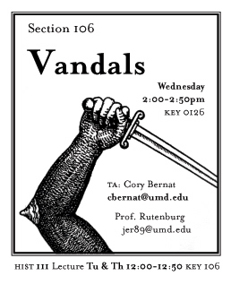
CLIENT: Teaching Assistant, UMD
PROJECT: Sticker handed to undergraduate students on the first day of Medieval History course (HIST111) with important information not to be lost.
The professor divided students into historic “tribes” based on section number, including the “Vandals.”
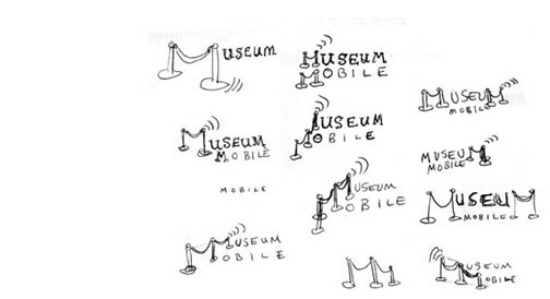
CLIENT: MuseumMobile Wiki
PROJECT: Identity mark for The Museums to Go Working Group, an "ad hoc consortium of museums aiming to build open-source mobile
browser and/or app solutions quickly and efficiently."